|
|
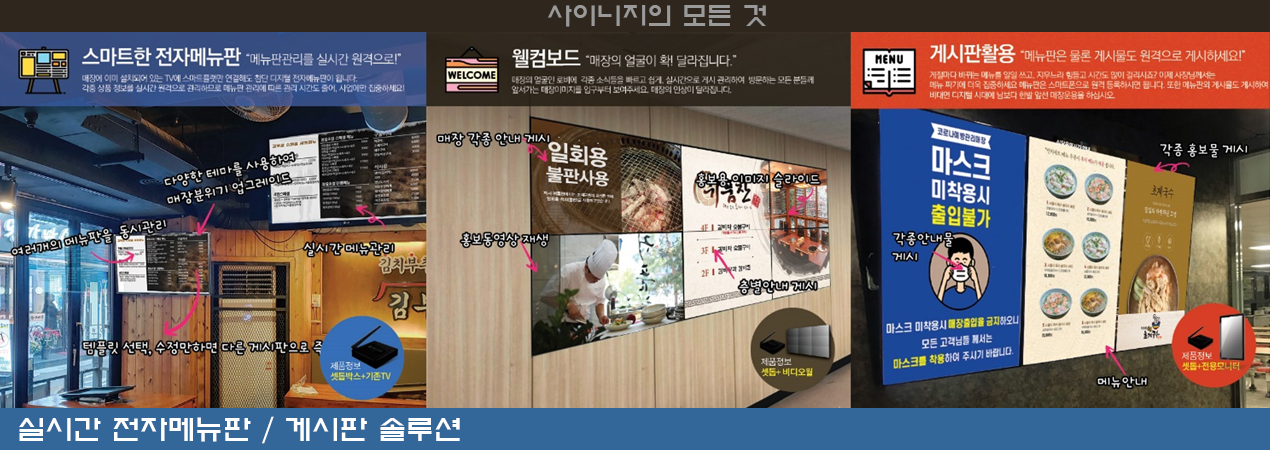
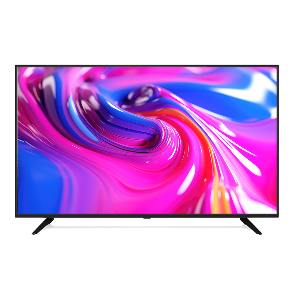
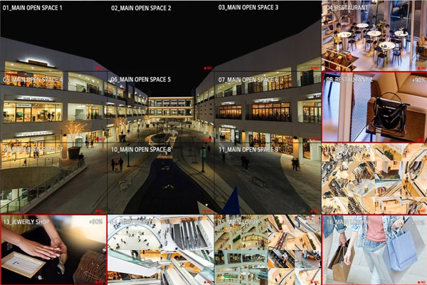
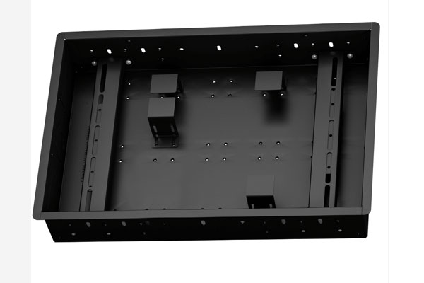
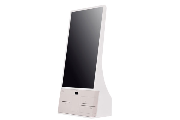
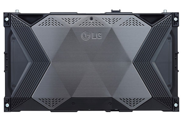
DGBOX(디지박스)는 모니터,솔류션,설계,설치,유통을 모두 한 곳에서 이루어져는 곳 입니다.

We have created a awesome theme Far far away, behind the word mountains, far from the countries Vokalia and Consonantia, there live the blind texts.Far far away, behind the word mountains, Man must explore, and this is exploration at its greatest. Problems look mighty small from 150 miles up. I believe every human has a finite number of heartbeats. I don't intend to waste any of mine. Science has not yet mastered prophecy.


고객님은 안전거래를 위해 저희 홈페이지에서 가입한 구매안전(에스크로) 서비스를 이용 하실 수 있습니다.


